


It definitely understood the assignment. Kind of.
In the name of research (and mild mischief), we decided to run an experiment: ask ChatGPT to design a business dashboard.
After all, AI is everywhere. It writes code, summarises documents, and occasionally insists the capital of France is Brussels. So we asked ourselves: What would happen if we let AI design a reporting dashboard from scratch?
Spoiler: it was... informative. And also deeply unhinged.
The Brief (aka “The Setup for Chaos”)
We gave ChatGPT a task:
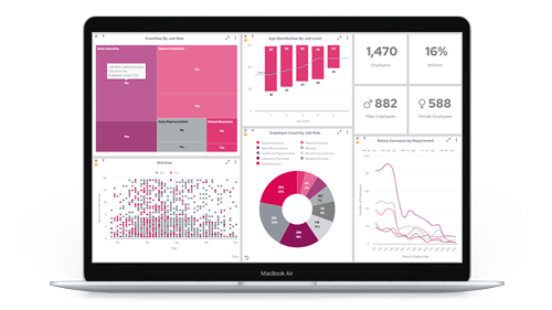
“Design a dashboard for a mid-sized SaaS company’s leadership team, showing key KPIs for sales, customer success, and product.”
Simple enough, right?
Well, here’s what our AI assistant returned...
1. The KPIs Were... Creative
ChatGPT's proposed dashboard included classics like:
- Monthly Recurring Revenue (MRR)
- Customer Churn Rate
- Average Time to Resolution
So far, so reasonable.
But it also suggested:
- “Customer Happiness Quotient” – a completely made-up metric it failed to define
- “Salesperson Enthusiasm Index” – scored out of 7. Where 7 = “wears branded hoodie voluntarily”
- “Dashboard Usage Satisfaction Score” – a feedback loop so existential we’re still recovering
2. The Layout Was Peak 1998
The dashboard layout was charmingly… optimistic.
- 12 KPIs in a single view
- A heatmap for "lead warmth"
- A sparkline chart with more colours than a Skittles bag
- A motivational quote widget (“Success is just data you haven’t visualised yet”)
- A chatbot in the corner explaining how to use the chatbot
It was like giving a toddler crayons and saying “draw productivity.”
3. The Logic Was, Technically, There
The AI-generated dashboard included calculated fields like:
“Net Revenue Growth = (New Revenue + Expansion - Churn) x Market Sentiment Multiplier”
We still don’t know what a Market Sentiment Multiplier is. Neither does ChatGPT. But it sounded confident. Which, as we know, is 87% of dashboarding success.
4. It Offered Suggestions. Lots of Them.
Once we’d reviewed the first pass, ChatGPT offered helpful ideas to enhance the experience:
- Add a “real-time CEO approval meter”
- Incorporate team emojis to boost morale
- Allow sales reps to “react” to dashboards with GIFs
We’d gone from BI to Buzzfeed in under three minutes.
So… Did It Work?
Actually, yes — in some ways. ChatGPT captured the essence of what a dashboard should be: informative, accessible, relevant.
But it also showed us what it isn’t:
- A replacement for user research
- A stand-in for governance or context
- A silver bullet for understanding your business
AI, for all its brilliance, doesn’t know your organisational quirks, your real decision-making pressure points, or why that one team refuses to stop measuring revenue in Post-Its per quarter.
The Real Insight: Support, Not Substitution
This experiment wasn’t just for laughs (although, frankly, it delivered). It reminded us that AI can absolutely support dashboard design — but it can’t own it.
It won’t ask the awkward “Why are we even tracking this?”
It won’t notice that no one’s looked at Tab 7 since 2021.
And it certainly won’t challenge leadership on whether “User Happiness Factor” is a vanity metric dressed in data drag.
That’s where people come in.
Final Thought: Use AI Like You Use a Calculator, Not a Crystal Ball
ChatGPT is a fantastic brainstorming partner. It can spark ideas, outline drafts, and suggest directions you hadn’t considered.
But if you're letting AI design your dashboards unsupervised?
Well... don’t be surprised when your next board pack includes a “Success Vibes Indicator” powered by lunar cycles and lunch orders.
AI doesn’t replace data expertise.
It needs it.