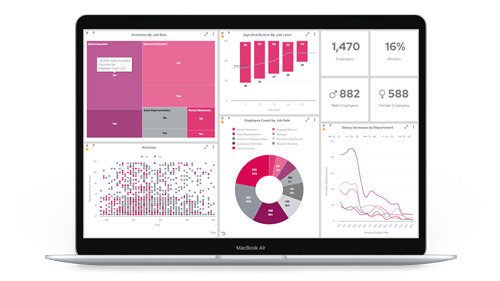


We’ll walk you through five core chart types that are important in visualising data, to enable you to make key decisions and gain a holistic view of business performance.
Contents:
Want to compare value sizes?
The bar chart is the one for you!
Bar charts are ideal if you want to compare several values against one another, with each being represented as one block, either horizontally or vertically aligned with the rest of blocks that make up the bar chart.
Example uses:
- Compare revenue generated by a team of Account Managers over a specific time period
- Compare sales of various products, in units or revenue
- Compare sales by certain regions, individual stores, etc.

Our top tip: When to use horizontal line graphs
In many situations, users prefer to stack their bar charts vertically. However, in Panintelligence, you have the option to select a horizontal bar chart as well.
Horizontal bar charts are useful when the data you’re using has long row labels, as the labels are easier to display.
They’re also more mobile-friendly, especially when working with large data sets, and they're also useful for showing rankings or order.

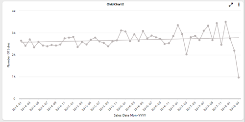
Want to see trends over time?
Get yourself a line graph
Line graphs are ideal if you want to look at continuous values over time. When plotted, you can effectively ‘connect the dots’ and see if whatever you’re measuring is going in an upward or a downward trend.
Example uses:
- Track and compare the number of sales across a set time period, broken down by day, week, month, etc.
- Track cumulative annual revenue or profit, broken down month on month over the span of a year, for example
- Compare leads generated, month on month, or year on year, for example
Our top tip: Add a trend line to get instant insights
If you have many different points plotted, which vary quite a lot, it can be difficult to pick out a general trend at first glance. In Panintelligence, you can add a trend line over the top to instantly learn the general performance of whatever you’re measuring.
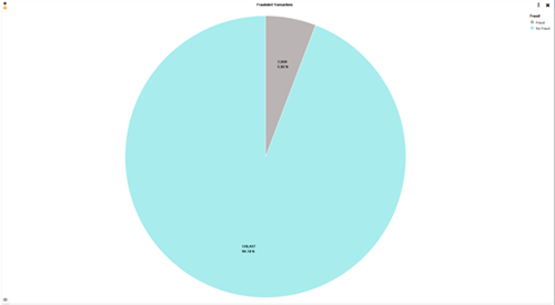
Want to easily see proportions?
The pie chart is the way forward
A pie chart is a great way to break down an overall figure into the proportions that make up the total amount. From there, it allows the user to see what the biggest contribution to the total is, and what percentage the other elements make up.
Example uses:
- Compare top customers by percentage of overall revenue
- Assess which are your best-selling products either by quantity or revenue
- Look at market share between you and your competitors
Our top tip: Upgrade to doughnut charts
Doughnut charts are like pie charts, but with a small circular cut-out in the middle, turning the filled pie into a hollow doughnut.
There’s a psychological reason why doughnut charts are better for visualising data, and it’s because when the centre of the pie is removed, your attention is drawn to the circumference and you judge each piece according to its length. Essentially, they’re easier and quicker to analyse.

Monitoring KPIs?
Use a lightbulb chart
Every business has important measures that need to be tracked to get a clear sense of performance.
A lightbulb chart can show the current status of any measure and different colours can be assigned to certain values (i.e. red, amber, and green) to allow the user to easily know where the business is tracking in relation to targets.
Example uses:
- Track total profit or revenue and compare performance against targets
- Track the average order value of a customer
- Track the overall satisfaction rating of customers who have dealt with your Support Team

Our top tip: Consider opting for a speedometer chart
If the current status of whatever you’re tracking is the most important thing, then a lightbulb chart or a traffic light chart is the ideal solution.
However, if you want to track a value within a range, then a speedometer chart may be the better option. For example, you can set a value at the lowest end of the scale and then a high value at the other, and track where you’re currently performing within this range.

Looking to show data at different stages?
Put that data in a funnel chart
A funnel chart represents a flow of data inside a process. Imagine that all the data you’re inputting starts at the top and then only a percentage of that data ends up at the bottom.
You would typically use a funnel chart to show conversion rate or stages in a sales process.

Example uses:
- A flow of leads generated, down to qualified leads, prospects, and then finally, sales
- Traffic to your website, starting with the homepage, down through product pages, to conversions
- A visualisation of the number of users who add an item to a shopping cart, vs. the number of users who actually go on to purchase items
Our top tip: Try a funnel chart over your marketing data
Funnel charts aren’t just for showing sales, they’re for any situation where the number of items in the first stage is expected to be greater than the number in the final stage.
Try visualising marketing campaign data in a funnel chart – you’ll be able to visualise how many emails were sent, vs. how many recipients opened the emails and, finally, how many people clicked on any of the links.
This data can help you analyse and improve your campaigns for a better conversion rate.
Are you ready to visualise your own data in charts and start exposing brand new insights? Get in touch for a free trial license of Panintelligence.