


When BI reports have been set up properly, new insights can be gleaned from data and organisations are in a stronger position to optimise their strategies. With that said, here’s a list of 5 best BI practices for better data reports.
Contents:
1. Understand the parameters of your reports
Start off by knowing who the end users for your reports are and what decision-making will be done throughout the process. That way you’ll have a better understanding of your target audience and the deliverables that need to be reached.
You can do this by creating a list of all key stakeholders and arranging times to interview each person. This could be face-to-face, over the phone or on a video call. In each interview, gather all reporting requirements and ask questions like:
- What kind of reports do you currently use?
- Why do you need a specific report?
- Who will use a report?
- What type of device will be needed to access reports?
2. Determine the KPIs for each report
The next stage is to have a clear view of the KPIs that need to be measured for all your data reports. As part of your interviews with stakeholders, you can gather this information and get an idea of the types of metrics they are interested in seeing.
The types of KPIs you might include in a report are varied. An example is a quantitative KPI e.g. a percentage. Quantitative KPIs are the most common and are usually represented by numbers.
Another example is a leading KPI e.g. the amount of enquires that are coming through. This type of KPI is useful for predicting the future success of your business.
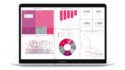
3. Use the best visual representations for KPIs
When presenting your KPIs in a report, remember to choose the right kind of visualisation i.e. a flow chart, pie chart or graph. If you were to use the wrong kind of image, then it could waste time and an end user would be unable to make sense of what has been shown.
In the instance of having to breakdown multiple KPIs at once, a good choice may be a single column KPI. This is a chart type that shows data and metrics in individual bars columns or lines. The breakdown can be done by groups or users e.g. sales revenue being visualised by region and month.
In the case of specific trends, it’s worth showing the data in a trend chart. This type of graph is used to showcase when a value is either above or below a specific target. For example, contrasting data could be highlighted in different colours to help users find the values that are under performing.

4. Choose the right reporting technology
You know who you’re reporting for, you’ve got your KPIs and you know what kind of charts are going to be needed. Great! Now it’s time to use the most suitable kind of BI reporting technology to ensure everything can be viewed and shown in one place.
Panintelligence is an excellent tool for fulfilling these purposes. With automatic scheduling and alerts, you can craft highly detailed reports in a matter of seconds. In addition, all data in reports is monitored and any changes are delivered to the appropriate users.
There are also self-service dashboards that house all reporting data in a central location and each report is fully customisable.
5. Double down and keep learning
Data reporting is an iterative process that will continue to evolve over time. Stakeholders may change their mind on what KPIs need to be measured, new reporting features can be developed and customer behaviour shifts like the wind.
It’s important to keep on collaborating with the end users of the reports and ensure everyone is clear to task.
Build better data reports and more with Paintelligence
Panintelligence is an exceptional BI tool that creates in-depth reports, delivers self-service dashboards and harnesses the power of predictive analytics. Book your free demo today to see it in action.