


A gentle roast of manual reporting culture.
Let’s get one thing straight: data, on its own, doesn’t have an agenda. It doesn’t care about board packs, bonus season, or whose project is overdue. It just is.
But give that data to a spreadsheet-happy middle manager with a mild panic about quarter-end? Suddenly, it’s being “reinterpreted”.
Welcome to the curious world of manual reporting — where every KPI has at least three versions, and no one is entirely sure which one's real.
The Curious Case of version_final_FINAL2.xlsx
We’ve all seen it. The spreadsheet with 12 tabs, 18 pivot tables, and a filename that looks like it’s been through a messy divorce:
Q3_REVENUE_v2_final-FINAL_USE_THIS_ONE_updated-JessReview.xlsx
This file has become a rite of passage in many businesses — opened nervously, copied inconsistently, and emailed around like a cursed relic. You don’t trust it, but you daren’t question it. Someone once did and wasn’t invited back to the stand-up.
Copy, Paste, Repeat (and Hope for the Best)
If you’ve ever copied a chart into PowerPoint and then edited the numbers in PowerPoint to make them “more current,” congratulations — you’re part of the legacy BI system.
These are the small sins of manual reporting:
- "Fixing" formulas mid-presentation
- Filtering data for "clarity" (read: plausible deniability)
- Quietly deleting rows that don't "add value"
It’s not malicious. It’s survival. But it’s also fragile, untraceable, and deeply risky — especially when decisions worth millions rely on them.
“Let Me Just Tidy the Data” – Famous Last Words
Manual reporting isn’t just messy. It’s inefficient. By the time the data’s been downloaded, reshaped, coloured, summarised, sent, and re-sent, it’s already out of date. And that’s assuming no one broke the formula in Cell H37 while trying to fix the margins.
Every organisation has that one spreadsheet where no one knows how the totals are calculated, but everyone agrees they “feel right.”
It’s Funny Until It Isn’t
Here’s where the joke ends.
Because when reporting errors slip into board decisions, funding applications, compliance submissions, or regulatory disclosures, the consequences aren’t just embarrassing — they’re existential.
And in a world of shrinking teams and rising pressure, relying on spreadsheet gymnastics to explain performance is a liability, not a workflow.
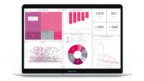
The Case for (Actual) Source of Truth
Dashboards, done properly, aren’t just pretty charts. They’re safeguards:
- Live data means fewer "updated" attachments
- Role-specific views mean no more "explain the whole spreadsheet to the intern"
- Audit trails and version control mean transparency — not trust falls
- Governance frameworks mean what gets seen, is seen right
At Panintelligence, we believe that decisions shouldn’t rest on a spreadsheet someone swore they’d tidy “after lunch.” They should be based on data that’s live, layered with context, and owned by the people who need it — not hidden in tabs behind VLOOKUPs older than your ERP system.
Final Thought: Everyone Has a Spreadsheet Story
Whether it’s the infamous “misplaced decimal point,” the rogue formula that tanked a report, or the moment you realised you were editing last quarter’s data, we’ve all been there.
But if you’re still running a business on copy-paste confidence and prayer, it might be time to ask:
Is your reporting process resilient — or just familiar?
Because data doesn’t lie.
But people with spreadsheets?
They do their best.